
A clearer place
for every client.
An interactive concept demo exploring a distinct workflow with sample data.
Local demonstration only. No live system is connected.
Start with a useful question.
A small service business keeps project updates, approvals and client information in different places. What would a more focused shared workspace look like?
The design direction
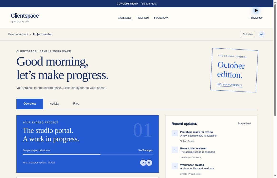
Clientspace explores a single view of the next action: what is in progress, what needs review and what information is still missing. The idea is to reduce ambiguity, not to add another busy dashboard.
- A visible project journey. Use a small set of meaningful stages so a user can understand the state of work without reading a long message thread.
- One place for review. Keep a sample deliverable, its status and the next decision together. In a real build, permissions and approval records would need explicit requirements.
- Context before contact. Show relevant project information alongside the task, rather than making the user search across unrelated screens.
What we would test next
Test whether a client can identify the next action and find a requested update without assistance. Observe confusion and missed steps; do not assume an interface concept has already improved communication.
What this concept does not do
No accounts, live client records, document uploads, notifications or approval backend are connected. The interactive demo only changes local sample interface state.
A useful reference.
Not a ready-made promise.
If this resembles your workflow, bring your own context. Requirements, feasibility and scope come before commitments.